CMYK or Pantone: Choosing Colours for Custom Paper Cups
Your logo may look blue on a screen, but “blue” is not a complete printing specification. For custom paper cups, the conversation needs a colour reference, an appropriate printing method and an agreed way to review the result. That is where CMYK and Pantone terminology becomes useful.
This guide helps you prepare that discussion. It explains the approaches without assuming that every method is offered for every ASWAL project. Printing options need to be confirmed for the selected cup and the order you are planning.
Understand process colour and spot colour
CMYK stands for cyan, magenta, yellow and black. Process printing combines these inks. Spot colour uses a prepared ink identified by a reference, such as a Pantone colour. Pantone explains the distinction between spot and process colour.
The approaches serve different needs. The decision is not about choosing a supposedly premium option by default. It is about describing the artwork and identifying which colours are especially important to your brand.
Separate what you know from what needs confirmation. You may have a Pantone reference without knowing whether it will be printed as a spot colour or reproduced another way for this project. Provide the reference and ask how it will be handled rather than assuming the production method from the name alone.
Start with your existing brand standards
Look for your company’s brand guidelines. They may define the same brand colour in several ways, including screen values, CMYK values and Pantone references. Those specifications have different uses and should not be substituted for one another without review.
If you do not have formal guidelines, collect the logo files and printed examples you consider representative. Explain what needs to remain recognizable. Previous packaging can help frame the discussion, but its appearance does not automatically become a colour specification that can be reproduced on every other material.
For a franchise or partner brand, obtain the officially approved version. Avoid sampling a colour from a social media screenshot. You may be using an edited image as the main reference without realizing that its appearance differs from the brand’s original artwork.
Compare the artwork requirements
| Design content | Discussion to have | Useful review point |
|---|---|---|
| Simple logo with an important brand colour | Reference and proposed reproduction method | Agreement on the intended result |
| Photograph or multicolour illustration | Method suited to the composition | Detail and readability at final size |
| Several partner logos | Colour priorities and permissions | Approval by the relevant brand owners |
| Design across several cup sizes | Consistency between versions | Review of each size adaptation |
Process colour suits multicolour images, while spot colours address defined references. Some Pantone colours fall outside the CMYK range, so a conversion cannot guarantee an identical result.
Ask ASWAL which approach is suitable for the artwork and selected product. It is better to confirm the available production options and ordering arrangements before prescribing a method that may not fit the project.
Supply the complete colour reference
A note saying “Pantone blue” is not specific enough. Send the full reference you have, including its designation. Pantone’s systems include references presented on different papers; C and U distinguish coated and uncoated paper references. Its graphic design colour systems provide context for those designations.
Do not decide on your own which designation should replace the original for a paper cup. Provide the brand’s existing information and ask how it will be used. This avoids changing a brand specification before the supplier has had the opportunity to review it.
If the artwork file contains several logo versions, identify the one intended for production. A file containing a screen version, a print version and an older palette needs clarification before approval. Clear labels are more useful than leaving the supplier to infer which version you prefer.
Choose the product before final colour approval
The printing surface belongs in the colour discussion. Confirm the cup reference, size and printing arrangements before treating the design as complete. Approval for another project should not automatically be carried over to a different product.
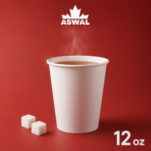
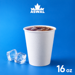
ASWAL’s 12 oz Hot Paper Cup and 16 oz Cold Paper Cup are separate references to assess according to beverage service. Their capacity, intended use and proposed artwork should be associated with the correct file in your project record.
For several sizes, make a list of the required adaptations. Identify elements that must remain consistent and elements whose position can change. This lets you review the brand as a coordinated family while still checking the layout for each individual format.
Use the screen to prepare the concept
Design My Cup helps you discuss logo placement and visual balance. It is a useful way to show your team and ASWAL the direction you want to take. The screen preview is separate from approval of the printed result.
Different screens can give different impressions of the same file. Rather than asking someone to reproduce “the blue I see here,” provide the available reference and agree on the approval method. If colour is especially important to the brand, raise that requirement when requesting the quote.
A preview also gives you a chance to simplify the composition. If a small accent colour has no clear purpose, discuss whether it belongs in the design. The aim is to make deliberate choices, not to remove elements solely on the assumption that a particular colour count determines the price.
Make approval unambiguous
Ask which document or sample will be used to approve the project and what that approval covers. Agreement on logo position does not necessarily settle every colour question. Separate wording, dimensions and any aspects of the printed appearance that still require confirmation.
Keep the approved filename, date and responsible person together. If a colour changes afterwards, identify the new version and confirm whether the proposal needs to be revised. A correction discussed verbally should also be recorded so it is not lost when the order is placed.
Prepare a colour request that can be reviewed
Choosing between CMYK and a Pantone-based colour specification starts with clear artwork, a selected product and a defined requirement. Review our guide to preparing logo files, develop your concept and request an ASWAL quote. Include your colour references and ask which production approach and approval process fit the project.