Paper cups have shifted from purely utilitarian objects to micro-canvases of design telling a story with every sip. Between production constraints, sustainability goals, and the need to stand out, they offer a fascinating creative playground. Here’s how to develop truly unique patterns and design iconic cups that leave a lasting impression without compromising usability.
Truly unique pattern ideas for paper cups
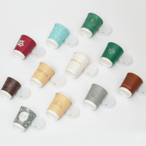
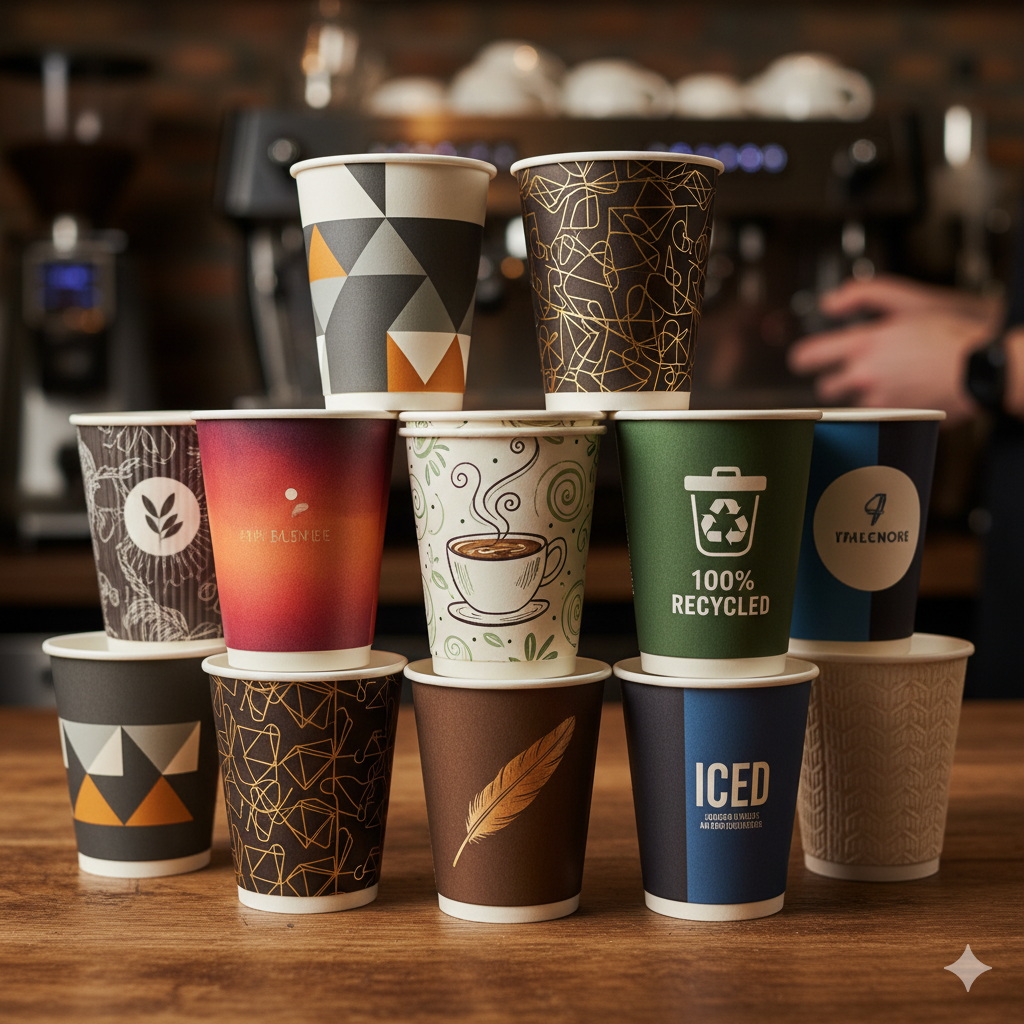
Go for 360° visual storytelling. A cup is cylindrical, which naturally invites a wraparound narrative: a scene that unfolds around the cup, a pattern that “continues” and reveals a hidden detail near the seam. Imagine illustrators turning the cup’s curve into a hill, a wave, or a horizon. The area near the rim can become a bright sky, while the darker base suggests textured ground. This subtle storytelling elevates the coffee moment and boosts memorability.
Experiment with visual and tactile textures. Textile-inspired grids (twill, tweed, raffia) or biomimetic patterns (bark, honeycomb, shell) can be enhanced with spot varnish, light embossing, or matte/soft-touch effects. You get a satisfying sensory contrast without adding excessive thickness improving grip and potentially reducing the need for a sleeve, especially on double-wall cups.
Add interactivity. Thermochromic inks can reveal a message when the drink is hot; elegantly integrated QR codes can unlock mini-games, playlists, or sourcing stories; micro-messages hidden in a repeating motif encourage social sharing. Even a simple pattern that aligns perfectly at the seam becomes a “satisfying moment” worth photographing turning the cup into a conversation piece.
How to design iconic paper cups
Start with constraints: shape, seam, and optical distortion. Work with the supplier’s real dieline not a perfect cylinder. Account for seam overlap, the stretch effect near the tapered base, and any non-print zones near the rim. Prototype on paper to verify alignment, logo legibility, and repeat scale once the artwork wraps into a 3D form.
Anchor the identity with a simple, memorable signature. Iconic designs often rely on a strong contrast (a striking duotone), a recurring shape (wave, chevron, ring, organic confetti), or a bold typographic gesture. Avoid overload: a well-chosen solid field, a rhythmic symbol repeat, and a strategically placed logo in a “breathing” zone 30–45° from the seam reads cleanly in either hand.
Balance aesthetics and responsibility. Use water-based or soy-based inks, optimize heavy ink coverage, and check compatibility with recycling/composting pathways and PFAS-free barrier options. Design for real use: a secure grip, clear legal info, size cues, and color differentiation by recipe (e.g., decaf, plant-based milk). Finally, build limited seasonal drops and collectible series consistent variations on a theme are how a design becomes iconic over time.
A paper cup is a small piece of total design: form, material, color, touch, and story all meet in one object. By respecting industrial constraints, crafting meaningful patterns, and refining the sensory experience, you create cups that go beyond function and become brand symbols serving a story with every drink, and earning iconic status through repetition and recognition.