Packaging is often a product’s first salesperson. In just a few seconds, it must catch the eye, reassure, tell a story, and trigger the purchase. Far from being a simple “outer layer,” it brings together design, material, and messaging choices that express the brand promise. Understanding how packaging persuades and why certain cues work has become a strategic skill in aisles overloaded with stimuli.
Understanding the visual codes that persuade
Effective packaging speaks the language of its category while adding a distinct signature. “Codes” typefaces, color palettes, layouts, symbols guide instant interpretation: sage green and stylized leaves suggest natural; gold and black signal premium; clear icons promise ease of use. The brain processes these cues fast: it recognizes, categorizes, then decides whether the product feels “for me” before reading a single word.
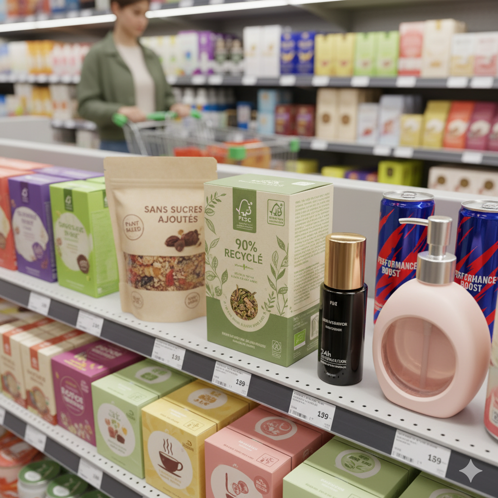
Visual hierarchy is the other pillar. A strong pack highlights one clear, credible benefit (90% recycled, no added sugar, 24h hydration), supported by an identifiable brand and a tangible proof point: an official label, a number, an expert endorsement. White space helps everything breathe; consistency across the front, sides, and back prevents confusion. This clarity reduces cognitive load and increases trust especially in quick shelf decisions.
Persuasion also comes from compact storytelling. An image showing the product in use a steaming bowl, a creamy texture, a hand opening it easily helps people imagine the experience. Micro-details reinforce authenticity: a subtle “craft” texture, minimally edited photography, a precise origin claim. But differentiation must remain readable: drifting too far from category codes can slow recognition. The sweet spot is honoring familiar cues while delivering a memorable brand signature.
Materials, shapes, and colors that reassure
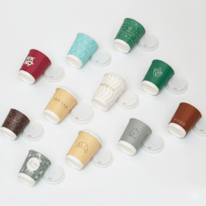
Material choices communicate values as much as they protect the product. Textured rigid cardboard or thick glass suggests quality and durability; a mono material pouch or refillable bottle signals environmental commitment. Touch matters: a soft matte finish conveys comfort, spot varnish draws attention to a key benefit, embossing adds a premium feel. Recognized labels (FSC, Cosmébio, OK Compost) turn promises into proof provided the information remains clear and specific.
Shape acts as a mental shortcut. Compact, stable silhouettes suggest reliability; rounded edges feel friendly; well-designed ergonomics (grip, wide cap, precise dispenser) reassure on usability. Clear windows and visible seals address the need for control and hygiene. Open/close mechanisms also signal quality: a crisp “click,” a resealable zip, a non-return pump. The more intuitive the gesture, the earlier the product experience begins.
Colors steer emotion and understanding. Muted, natural tones (earth, sage, cream) suggest authenticity and sustainability; strong contrasts communicate performance or technicality. In food, color cues aligned with flavor (red for berries, blue for mint) reduce ambiguity; in cosmetics, consistent palettes across a range guide selection. The key is optimizing text/background contrast for accessibility and checking real-world appearance (store lighting, mobile screens) where the decision actually happens.
To persuade through packaging is to orchestrate cues, proof, and sensation quickly removing purchase friction. Visual codes capture and guide, materials and shapes reassure, colors clarify and energize the message. By testing choices in context (in-store tests, eye-tracking, customer feedback) and anchoring them in an honest promise, packaging becomes a powerful conversion driver and a credible extension of the brand from shelf to everyday use.